Dark Mode Sucks

There I've said it.
The decision by major tech companies to add native dark mode support to their operating systems is the biggest mistake in the last decade.
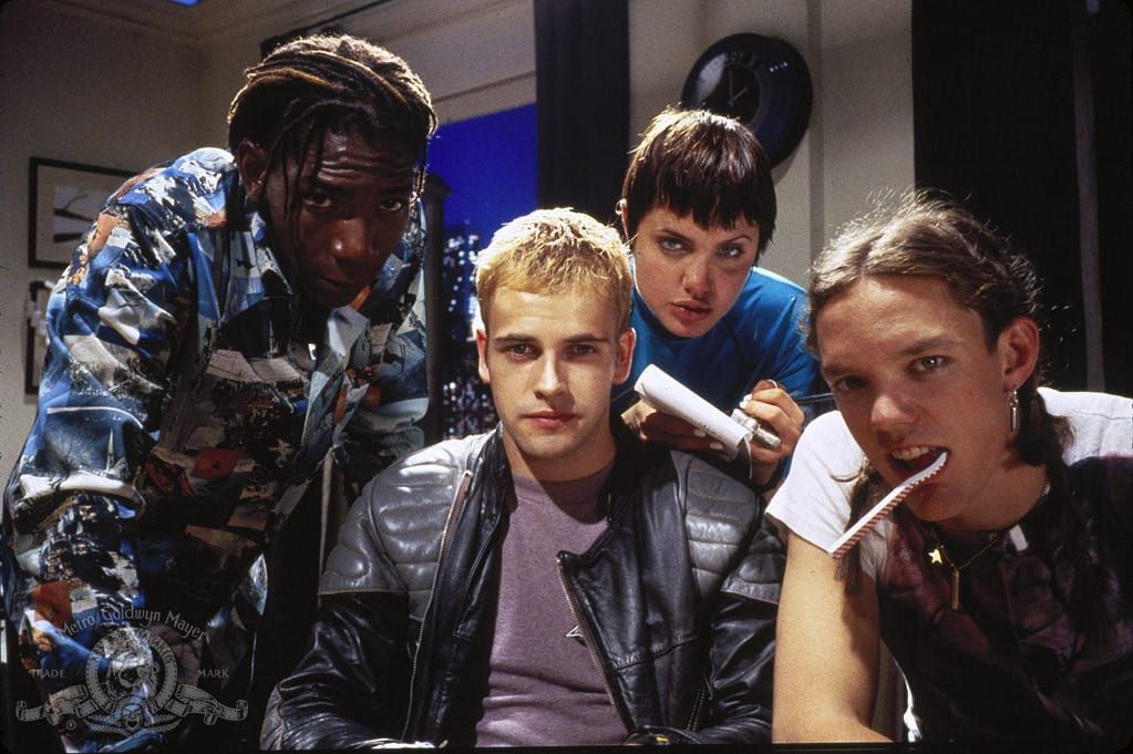
Does it look like you're doing some cool hacks with Angelina Jolie? I guess. But does it look good? Meh.
For very little rewards, we've doubled the work required for interfaces.
Is your screen too bright at night? Just turn your brightness down.
But no we've decided to make developers and designers alike design screens with multiple color palettes with a faulty notion that it was better for our eyes. Guess what? There's no evidence of it.
Most products are still being designed with one default style then converted to dark mode when there's nothing left to do. It's an afterthought in most teams and it shows.
If your product's default is a dark UI that's fine. No one's asking you to support light mode. But some think you should be obligated to provide dark mode for every product.
The only obligation should be to create a UI that works for your product and it's audience. If dark mode made a significant impact to one of those then by all means do it. But we should reject the notion that it's as necessary as responsive design.
Don't get me started on letting users customise icon colours.
Anyway...enjoy light mode or grow up.
P.S. This is very tongue in cheek. I don't like dark mode but to each their own.


