Designing A Brand For A Side Project

This one of my favourite parts of any project. After picking a name, which took me way too long this time around, I start designing a style for the entire project. Elements of this style usually come up in the development process so I use pieces of the design I already made to decide the main elements of the brand. Usually, that'd include a main colour, logo, wordmark and a general style for UI elements. I then use this style for screenshots and promo images.
UI Design
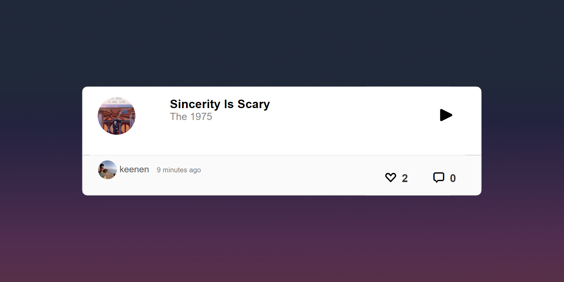
For my new project, Wave Radio, I wanted it to be colourful and playful without feeling childish. I usually do light themes but I also wanted to go with a darker palette this time around.
To get that playful feel I decided to build the UI around rounded cards. I wanted a dark theme but not completely dark so I made the cards white to pop on the darker background.

Every main element on the page has its own card. It's used on the sidebar, the post box, and for comments.

For the background, I tried a few solid colours but it didn't have that fun feeling I wanted to capture. It all felt a bit sterile. I tried a few gradients and found this one that I really like. It feels a little like the sky at twilight and the cards looked great on top of it.

I tried a few tweaks to the gradient like adding a transparent texture of stars above it. For a while, that was the default background but I changed my mind after a few weeks spent with it.
Then I had a random idea to have a dynamic background gradient that would change based on the time of the day. Does it improve the site in any way? No. But it looks cool 😅.
Here's what the final UI looks like.

That's my process for designing a brand for my projects. How do you go about this? If you have any feedback let me know and you can sign up for the beta at waveradio.co. Next, I'll be sharing my process for designing a logo and all the bad ideas I went through before the final version.